- CrustLab /
- blog /
- Explainers /
- Web development design – how to avoid traffic loss due to feeble UX?
Web development design – how to avoid traffic loss due to feeble UX?

The web development service consists of creating mostly business websites with a simple structure and more complex web applications running in a web browser. Historically, only computers were connected to the Internet, so products created as part of web development were adapted to be displayed on monitors and laptops, as that was the only need. Nowadays, thanks to advanced web and mobile technologies, users use the Internet in a completely different way. In 2020, according to statcounter.com, traffic from mobile devices accounts for more than half of all internet traffic.
Then, suppose you want to increase your website’s or web application’s conversion, extend the average time and engagement of users, and increase returning users’ rate. In that case, you have to focus on guaranteeing clear and intuitive UX design for both web and mobile. A high bounce rate and user frustration resulting from unreadable design and navigation, and too long loading times are signs of feeble UX design. Read this article to know what you can do to avoid losing traffic and be ahead of the competition.
The most common web development design mistakes
It is said that mistakes are the best teacher. However, learning from your mistakes can be both painful and costly. It is better to learn from the mistakes that others have made. Therefore, read the list of the most common UX mistakes preceding web development:
- Lack of any plan – creating web development design without a detailed plan that will define the goals, target group, structure of pages, wireframes, and content of individual subpages, a list of keywords, graphic guidelines, and content. This approach leads to endless tweaks, extends the entire web development process, and simply annoys the team that goes round and round instead of moving forward with the project. An effective plan should include a to-do list, timeline, budget, and a list of essential items to be prepared (e.g. graphics). By following this manual, you can easily create a plan like this:
- Define the goals and objectives of your project.
- Create a pattern that you will base on by adding more pages.
- Prepare a list of content – which you have or need to create.
- Create a task list – you already know what you want to achieve and what content you are missing, thanks to which you can create a list of tasks and determine the order of their execution. Remember to take into account dependencies between tasks.
- Set the time needed to complete each task.
- Having a general overview, calculate how much it will cost you. You can start work if you are within your budget or revise the plan to reduce project costs.
- Assign team members to complete specific tasks.
- Create a navigation plan, data and user flows.
- Create UX and UI designs.
- Define the goals and objectives of your project.
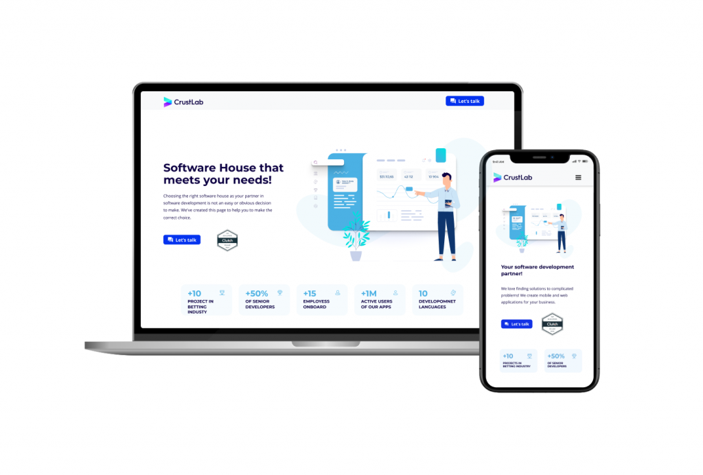
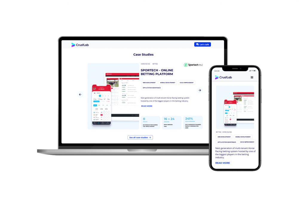
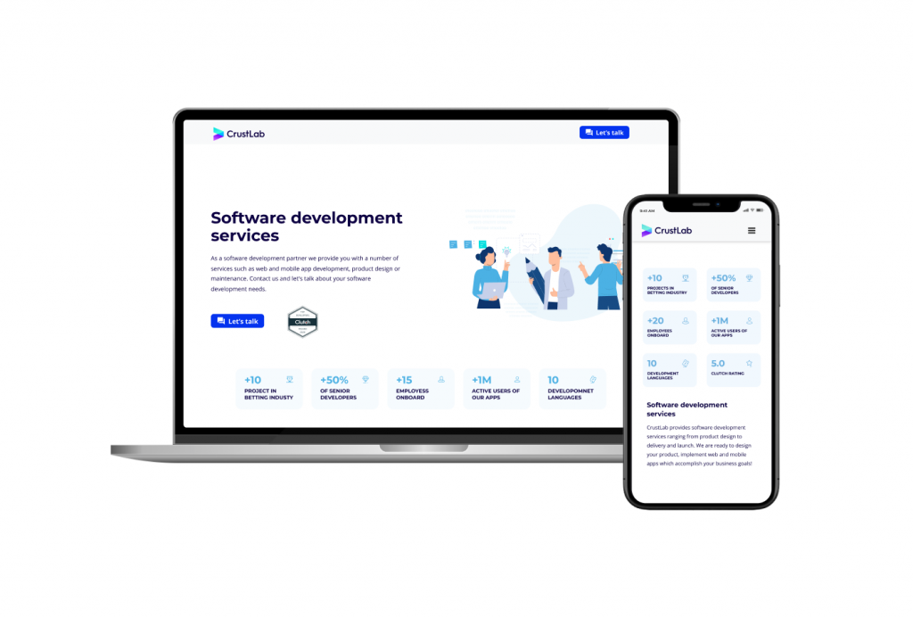
- Disregard for mobile – Websites and web applications that are not responsive are displayed incorrectly on mobile devices and are therefore not fully functional. Lack of mobile responsiveness is often a reason for user irritation (rage clicks – user behavior during which he or she repeatedly clicks on a given element or area without the desired effect) and increasing exit rate. Take care of the consistency of displaying individual sections in the desktop and mobile versions and test their scaling, e.g. how a web application will behave when you increase the number of tiles presenting your services or a case study.
Responsive Web Design is a necessity today. Keep in mind that you have to adjust the headers, paddings, fonts, shape and sizes of CTAs, forms, photos and illustrations, and test blocks’ length to mobile devices when writing content for simple websites. With complex web applications, the problem is more complicated. The desktop version typically presents full functionality, while the tablet and smartphone screens are often too small to show and handle large amounts of data on one subpage. It is sometimes required for mobile to split information into many subpages and completely different planning of the user’s path. Therefore, desktop and mobile versions of the software may have a different layout. The difference generates an additional scope of work. As a result, higher web development costs.

- Triumph of form over content – When working on a new company website or web application, use common sense instead of rushing to every new trend. Some solutions look good and intrigue but bring no benefit to your business. Each addition means more hours of developer’s work and increasing web development costs. Remember that each new item should appear for a specific reason. Every user uses your web application for a particular purpose. Be moderate in adding useless sliders, graphics, and movies. If they are not necessary, there will be an additional cost and difficulty in displaying the page correctly on mobile. When designing the user’s journey, try to define pain points. When you are aware of them, it is easier to add elements that will fix user problems, thus improve the overall UX of your web application and increase the conversion rate.
- Lack of balance – Focusing too much on the aesthetics of the web design can obscure some of the apps’ functionalities and make it difficult for users to use them. And vice versa. Too many functionalities not presented aesthetically will overwhelm users, especially the new ones. The ideal solutions for web development design are those that are sustainable. Adding features that are not critical, and only a good-looking idea may turn out to be unnecessary. Their creation means additional costs without the certainty that the investment will pay off. In the worst-case scenario, these features will also limit you and generate additional costs for the next months or even years of project development. Implementation of functionalities should be based on usability tests and business analysis or when you already have a live version of the MVP, based on user feedback.
Remember the principle of clean design. The amount of space for additional features is limited, and too much concentration of functionalities can be overwhelming and, as a result, scare the user away, reduce the attractiveness of the website and revenues instead of increasing conversion. - Lack of Usability Tests – Even the best-prepared plan and prototypes of a web application are only theoretical solutions based on individuals’ experiences and ideas. You will find out if your assumptions are correct only when real users start using the web app. Focus on the needs of users and carefully analyze how they use your web application. Testing is time-consuming and challenging to organize, but it allows you to eliminate critical errors and improve the final product’s quality. Usability tests should be performed when a clickable prototype covers most of the final UI/UX assumptions.
Check one variable per single test to make the conclusions binding. With that approach, you’d make sure that the prototype is ready or needs improvements and only then start a whole development process – that approach should significantly reduce web development costs. When the finished product is online, you can schedule A/B tests to assess the value of different versions of data elements such as product cards, landing pages, contact forms, or other versions of the CTA button. Remember to compare a sufficiently large data sample, periods of the same length, and test one thing at a time. Focus on the essential elements that are crucial to converting and test them regularly. Accept that some conclusions and the corrections made after them will be minor, don’t expect each test to change your business 180 degrees.
Tips on how to improve your web application design
Now that you know what UX mistakes to avoid in the design phase preceding the web development process, let’s move on to the list of tips and good practices that will help you improve the quality of the UX:
- Make a plan – Before jumping into web development design, write down all your ideas. Then do a thorough research of direct competitors, similar companies, and successful industry leaders. Based on the collected information, prepare mood boards and interface inventory. All these activities will serve as a starting point. Put your users at the center of your considerations because they are the key to success. To avoid UX mistakes, analyze the list of collected ideas, taking into account the user’s needs and convenience. The research result should be clearly defined problems, user needs, and the purpose of the web application. When you know issues, tune them into valuable solutions. Try to formulate tasks using the „How might we …” method and use the Canvas Business Model to write down your vision and present it to the rest of the team. To make the right decisions, conduct UX research to outsource to an external company, or carry out yourself.
Now that you have considered all the pros and cons and are sure your activities’ right direction is, it’s time for wireframing and prototyping, and further web development. For now, your plan is based on research and assumptions. Your next task would be to prepare the MVP version of the web application as soon as possible and show it to real users. Such an approach will allow you to draw further conclusions and validate your beliefs. Repeat this process until the perfect product is created. - Mobile-first approach – Adapt the design of your web app to mobile devices. A significant percentage of your users will use your products in this way. Keep this in mind when designing individual elements so that it is convenient to navigate through them with your thumbs. Following the Responsive Web Design principles, try to use fluid and adaptive layouts, responsive typography, and optimize the website’s display to the size of the most popular mobile devices and browsers. To increase the attractiveness of using the web application on smartphones, make sure you enable the use of functions typical for mobile devices, such as access to the camera, change of screen orientation, geolocation, etc.

- Performance optimization – Today’s internet user is very impatient. Therefore, even the best-prepared plan and carefully carried out optimization of a web application for mobile devices will be useless if its operation is slow and the loading time is more than a few seconds. Solutions such as lazy load non-vital images and videos, conditional loading, responsive images, and CSS compression will help you increase your web application’s performance and retain users.
- Collaborate – You can make the design phase preceding web development workflow much more straightforward by directly designing in the browser. You can save many hours by working in a browser thanks to tools such as Figma, Bootstrap, Foundation, Bulma, Materialize or others. This approach allows for better communication in the team because several people can simultaneously work on a given model. It can also help you avoid significant differences between the elements in the mockups and those that are finally in the source code of the web application.

Summary
As you can see, the web development design process is a complex process that involves a lot of issues that require special attention. Working on improving the UX of web products is not easy, but it will undoubtedly pay off. At CrustLab, we have many years of experience in this type of service and high-class specialists who are ready to help you. However, if you want to face this challenge yourself, prepare a web application plan based on the above article and send it to us, and we will share the feedback for free.

